Findings from a Similar Landing Page in a Foreign Region
Different audiences have different preferences for what they want to see when landing on your page from an ad. I have the results to back it.
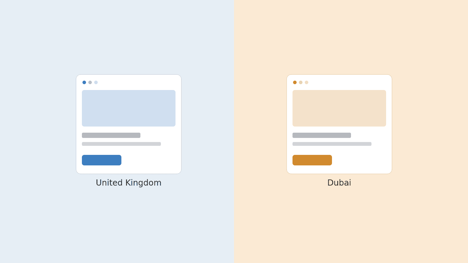
The fundamentals of human psychology have remained the same since the dawn of time, so why is it that a landing page in the same style across the UK and Dubai can perform so differently?
This was the exact question I was faced with recently on our professional services Google Ads account, and today I am going to share my findings with you.
Hello everyone! I’m Lee, and I am a paid media B2B lead gen specialist operating as a Paid Media Manager at The Rise Group. This is my first ever article, and I hope my excitement is felt through the words on your screen.
Allow me to share my findings from a recent landing page test we ran in Dubai and the UK. The campaigns for the UK and Dubai both had the same keywords and overall structure, bar a slight difference in budget.
The Experiment: Hidden Dropdowns vs. Upfront Copy
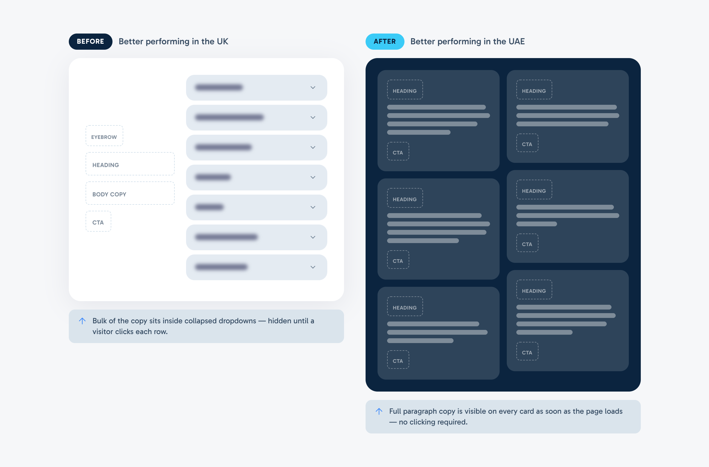
After making layout changes to our Dubai landing page and seeing improved performance (see comparison below), we wanted to experiment with this style on the UK page.
On our original landing page, the bulk of the copy sat inside collapsed dropdowns—hidden until a visitor clicked each row. In the updated layout, full paragraph copy was visible on every card as soon as the page loads, with no clicking required.
(Key context to consider is that the summer months are historically slower for these professional services conversions in the UK.)
The 5-Week Test Results
When we ran both layouts across a 5-week test window, the results were completely polarized:
| Market | Conversion Rate (5-Week Window) | Performance Delta |
|---|---|---|
| **Dubai (UAE)** | 7.27% | **+68%** 📈 |
| **United Kingdom (UK)** | 2.71% | **-49%** 📉 |
I was surprised (to say the least) at these results.

Why Did We Make the Change in the First Place?
On our previous landing page, information about our services was hidden behind clickable dropdown boxes:
- Fewer words on screen
- Fewer CTAs
- Fewer images
- More "dead space"
Notice a theme? We had significantly more dead space on the original landing page.
So why did we change it to have more information readily available with more CTAs?
Quite simply, we saw an instant lift from our updated Dubai landing page, and we wanted to replicate that in the UK. Our Hotjar session recordings showed that most user clicks came from expanding those service dropdown boxes. In theory, by putting that information upfront so visitors didn't have to click, performance would improve in the UK right?
Nope.
What the Data Tells Us
United Kingdom: The Risk of Information Overload
An increase in on-page copy availability reduced visual emphasis on the primary CTAs and client testimonials sharing the brilliant work we've done for high-growth SMEs.
It could also be argued that this UK audience is more vulnerable to analysis paralysis—the cognitive state where a visitor becomes unable to make a decision due to information overload. In the context of clicking through from a paid ad, our UK audience responded far better when presented with concise copy and dead space.
Paid search visitors arrive with high intent but low patience. In the UK market, forcing readers to digest full paragraphs upfront diluted the clarity of the call-to-action. Less was undeniably more.
Dubai: Intent-Driven Precision
Dubai has historically had a higher conversion rate than the UK on our Google Ads account, but this test widened the gap dramatically (+68% CVR lift).
The UAE audience responded much better to having full paragraph copy immediately available on the cards. There is a strong argument that this audience arrived with a clear sense of what they needed, evaluated the complete service description upfront without clicking friction, and converted immediately.
Key Takeaways for Paid Media Landing Pages
- Audience Psychology is Regional: Different markets and cultures have distinct preferences for how much detail they need before taking action. Never assume a winning layout in one territory will transfer automatically to another.
- The "Help vs. Hinder" Filter: When editing landing pages, always ask yourself: Will this change help someone convert, or give them a reason to click away? In many B2B professional services contexts, less is more.
- Let the Data Lead: What seems logical in theory (e.g. eliminating clicks via Hotjar insights) must always be proven in the live auction. Always let conversion data, not design assumptions, make the final call.